Audio initial impressions
When listening to the audio samples, these were the way I interpreted it visually.
Moodboard
Beat Sheet
Storyboard
Here’s what I’m trying to achieve:
- shaking a cup introduces character. fingerless gloves will have some rips to represent his poverty.
- person walks into frame. the person is in the upper half of the frame to show their position of power. The homeless man will be in the lower to reinforce this.
- the person revealed to be a woman looks down on him and pulls a face of disgust
- she turns into a bum and starts feeling her face/panicking
- clean fresh shoes walk across the frame
- a man is revealed and he says “get a job
- “bum” as there is a close up of his bum chin which represents the insecurities of the people who look at the homeless as if they aren’t real people
During the frames of the snobs, there will be flies to illustrate their personality and juxtapose their so called cleanly appearance. It’s almost as if inside they are the dirt.
In my next drafts, I have changed a couple of things. Thanks to Mariana’s advice, I have pushed the perspective even further to illustrate the power of wealth . I have changed the one women to a group of people to emphasise the problem. I have also readjusted the first panel to increase its readability.
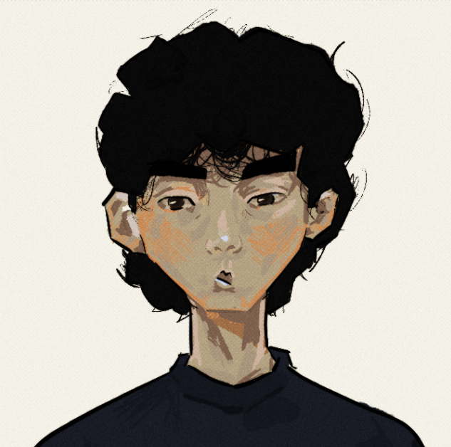
Character Designs
For the homeless man, I want to emphasize his poor health, poor hygiene and scruffiness. This will directly juxtapose the business man, who will be presented as a model “masculine” man through his powerful stature and expensive items.
I used shape language to illustrate a bad posture with the homeless man through a curved line of action in contrast to the upright posture of the business man. The upright posture reveals the confidence of the business man. Whilst with the homeless man, a crooked back would represent the effect of sleeping on the streets, possibly linking the anti-homeless architecture. The walking stick exaggerates his bad back and could be context for why the homeless man is physically unfit to work.
The homeless man shape design is also tapered. This would create a softer, less aggressive design making it easier to feel compassion for the character. Contrasting this, the business man is a square to link to his aggressive and intimidating nature.
The homeless man has a scruffy beard. The line work representing this is random to illustrate his unkept nature. The business man has a neat mostache to illustrate his kept nature.
Clothing wise, the homeless man has a scarf, hat and gloves to illustrate the struggle with obtaining warmth. He has a hole in his jeans and a patch on his jacket which conveys his poverty. In stark contrast, the business man wears a ring, shiny shoes and watch that will be highlighted through a light sparkle. He will also wear glasses, which would illustrate that he is “educated”. This represents his privilege and supports why he would act negatively towards the homeless man. Generally people don’t like whats different to themselves.
I chose my characters to be stylized, not only for the sake of efficiency but also so I can exaggerate the personality of the characters through shape language.
I have decided to keep the characters flat as I want to portray a childish tone due to the animation being shown through the homeless man’s point of view. This would represent how hostile behavior towards the homeless is immature. This is also reinforced through colouring outside the lines and the simplistic facial features. I may experiment with textures and gradients in post.
I have chosen a limited colour palette, contrasting between the two characters. The business man has blueish skin to illustrate his cold nature. His tie is purple which represents his socio-economic power. His suit is grey to represent his conformity to society and his lack of life. The colour palette is dull in comparison to the gold for his jewelry. This is so the viewer can catch on easily to his wealth.
The homeless man’s skin contrasts the business man by using a saturated and warm colour. This, with the support of the beige jacket, makes it easier to feel sympathy towards him. He wears a green scarf and hat which can symbolise new beginnings.
The snobs follow the same colour palette to group them and illustrate that it’s multiple people. They are all a diverse group of people in terms of age and facial structure to convey how it can be anyone who picks on them.