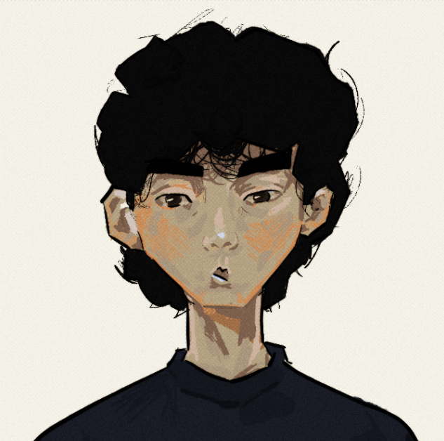
Since I was 14, I taught myself how to use After Effects so I was confident coming into this rotation.
Task 1
The first task was to complete a variety of exercises that taught the basic elements of animation in after effects. Due to my knowledge, I applied more advanced methods such as using the graph editor and easy ease to complete these tasks quicker.
TO IMPROVE: When I received feedback, the squash and stretch were criticised. I have made a newbie mistake in which whilst it squashes, the mass of it doesn’t remain the same therefore it is unnatural.
FINAL IMPRESSIONS: Unfortunately due to this being the gazillionth time I have used AE, I didn’t learn much with the program. Due to the lack of squash and stretch in my previous works, I have learnt the importance of keeping the mass the same and how to do so (thanks jess!). This rotation has familiarised me with the animation principles and has helped improve my awareness of how to manipulate them to create the type of animation I would like to.
Task 2
For this task, we explored animation in PS. In the past, I had animated in this program before but it was discouraging to animate with it in my free time due to the software not specifically being designed for animation. We were challenged to create an overlapping animation on a jumping stick figure.
FINAL IMPRESSIONS: I am pleased with how this turned out. The motion feels fluid, the timing feelings correct, the follow through seems appropriate and everything works together well. Would I use Photoshop for animation again? Probably not. The program is not optimised and it feels messy to work with for animation. I would’ve liked to explore toonboon instead as I heard that was the industry standard I am excited for this to come.
Final Task
We were given a task in which we had to create a 10-second animation based on a moonscape provided to us. This task was very exciting. Unfortunately, this clashed with the time I had to go to Liverpool to do my driving test. I felt like this had a lot of potential but for the time I spent on it, I am extremely happy with the outcome.
In my personal opinion, to create engaging and interesting art, contrast is the most important element. Whether it is through colour, movement, texture or composition, I had to consider how I would manipulate the elements to create an engaging 10 second animation. The emotion (if it is classed as one) I had chosen to portray was energy.
THE PROCESS: The first thing I did was look at the works of others. This is important because you can get an idea of how they use elements to achieve their desired effects. We were asked to create a moodboard. Fortunately for me, I have multiple banks on Pinterest in each discipline I was interested in where I collected media I enjoyed and felt I could learn from. For the mood board, I didn’t focus on the emotion as I felt that would restrict the potential so I decided to use my Motion Graphics Inspo board on Pintrest. The best thing about pintrest is the images remain animated. I also looked the examples Mariana showed us, they were very good.

Next in the process was the plan for the animation. I decided on having a simple A -> B due to the 10-second restriction. I also decided that I would make it loop so even if it was 10 Seconds, people could watch it for however long they would have liked.

This was my initial idea. My usual work process is to usually not dwell on the plan as much, as I feel like art is a journey and development happens as you work on it.
Before starting my animation, I decided to record myself dancing to the soundscape to provide myself with a reliable reference to work from. I believe this saved a lot of time and insured I made natural movements.
Next I decided to actually start the animation. There were many decisions I made and I will start to explain them. For the actual animation I decided to go with a simple character to make the process shorter. The feeling I was trying to explore was that feeling when you’re at a social event and you try to enjoy it as much as possible then you realise that you shouldn’t be there. I decided to duplicate the animation and offset it by a frame and I made the colour go from red to blue. This is representative of how in temperature, red is hot and the particles have a lot of energy and when they don’t have a lot of energy, they are portrayed as blue. I also decided to scale him down when he runs out of energy as I usually feel small when I am tired. I finally added some basic effects to add more depth such as adding a paper texture.
FINAL IMPRESSIONS: I am pleased with what I have produced in the time I had. There is nothing I dislike but of course I feel like this could have been developed further and I could’ve explored different elements more to create a better animation.
