Story
Our first task to figure out was the story. We spent longer than others on this process element to ensure we created a story people could resonate with whilst still taking the viewer through an emotional journey.
Our first draft of our storyboard communicated our story clearly but we had to optimise it to be more efficient so it would fit the 20 seconds.
Our second draft optimised the first storyboard, but there were still changes that could’ve been made to make it more effective, such as how the viewer understood the story.
We then put the storyboard in the context of timing by creating an animatic. The composition wasn’t the best in many frames, but the storytelling was more effective.
The timings felt good but there were a few continuity errors that Jess had mentioned to us such as the cup being spilt is not in the scene where the paint meets the jacket. For some reason, my peers didn’t address this which hurt the final animation.
TO BE IMPROVED: Next time, the rough animation will be polished even more to ensure a readable story. I believe this was the weakest point of this process which hurt us in the future.
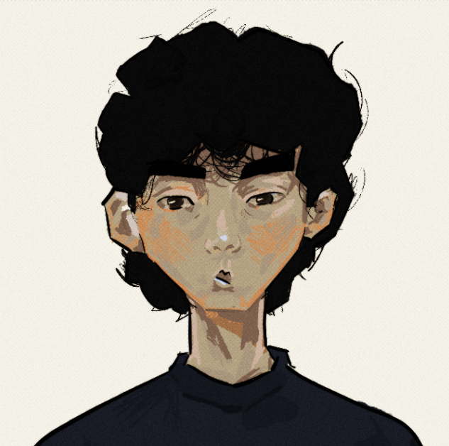
Character Designs
I collected a variety of imagery that would help us determine the visual style of the characters.
I drew out two designs of how I thought the characters could look. Unfortunately, creating stylised drawing was one of my weaker areas.
Fortunately, Sophie’s stronger point was her ability to create styled art. These designs have a contrast between them in terms of shape language. The dad is more square whilst the girl is more oval. Her hair is messy whilst he is neat and straight.
Environments
This element was handled by Nadine. She researched and created an effective background used in the animation.
The set was created in a way which allows the focal point to be the characters. This is done through colour and value.
Animation and Compositing
After we had all the assets, we started production and produced the animation. Due to the short amount of time, we had to work on this part, the animation itself isn’t engaging as it could have been. For example, the same reaction shot is used twice. This is visually boring. This also happens when the girl turns her head as it detracts from the movement of her hands which disconnects us further from when she spills the paint.
In the compositing stage, I added textures to the dad’s jacket and the hair of the character. I tracked this through an alpha mask. This idea was thought of by Sophie as inspiration that has been taken from Chowder. We had prepared for this by colouring the hair in a different colour.
Unfortunately, no matter the number of times I told everyone, they did not create a different layer for each part of the character. This frustrated me as it would narrow the experimentation we could do with the colours such as seeing the effect if the girl’s clothes were slightly more saturated.
I also added a grain texture and white dots texture to help add an extra layer of depth. I did this in a way where it would be subtle as we want the viewer to focus on the characters and not the textures.
For the Sound Design, I recorded most of the sounds myself but used a few which I couldn’t recreate such as a little girl crying. I had music made for this animation, but after some feedback, I now realise that it was too distracting from the story aspect.